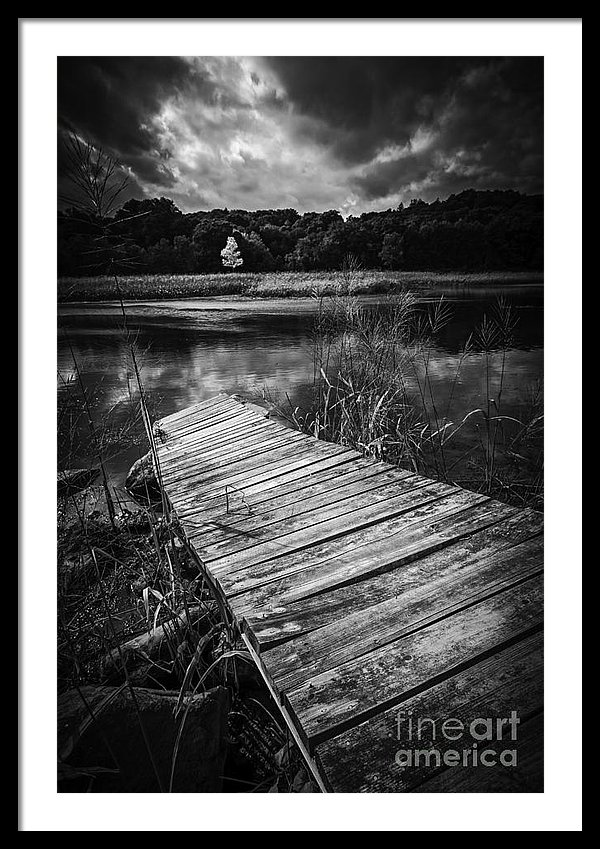
Above: “The Tree of Zen” by Edward M. Fielding
In photography and art, a compelling, interesting subject can be made stronger by the arrangement of the elements within the bounds of the image.
Composition is the conscious thought of putting together and arranging the elements within the frame.
In “Tree of Zen” the elements and lighting are structured as such that the viewer’s eye is drawn into the scene following the old dock, across the water and to the white tree in the background. Good composition allows the viewer into the scene and holds the viewer’s attention by drawing them in to look around the image.
The elements of design are:
- Line — the visual path that enables the eye to move within the piece
- Shape — areas defined by edges within the piece, whether geometric or organic
- Color — hues with their various values and intensities
- Texture — surface qualities which translate into tactile illusions
- Value — Shading used to emphasize form
- Form — 3-D length, width, or depth
- Space — the space taken up by (positive) or in between (negative) objects
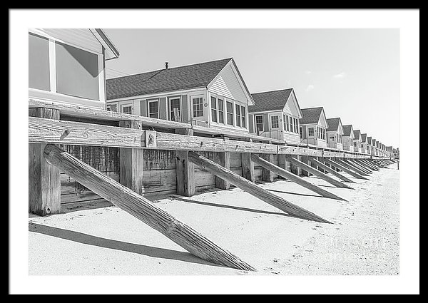
The above photograph of Days Cottage provides an example of leading lines and a vanishing point.


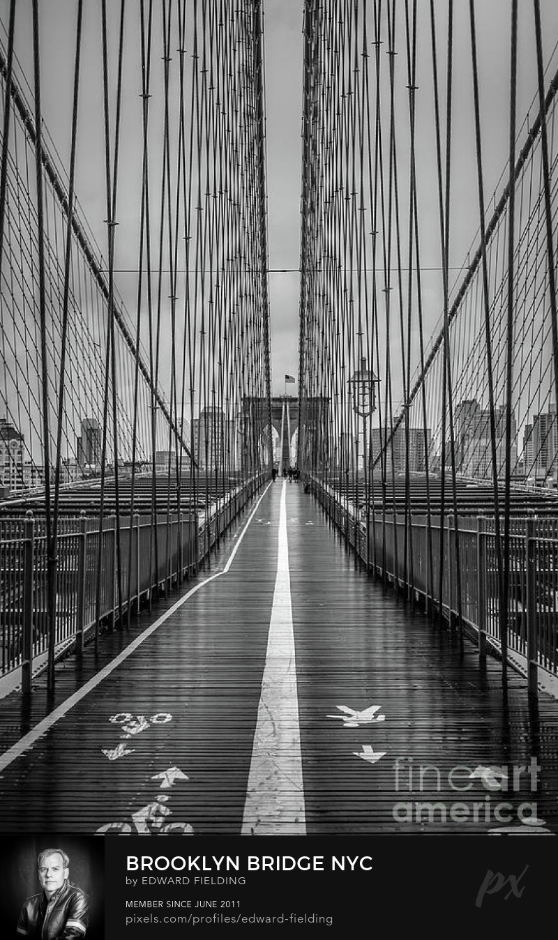
Symmetry can create strong compositions. In this dock photograph, we have the compositional elements of rule of thirds, leading lines and symmetry.
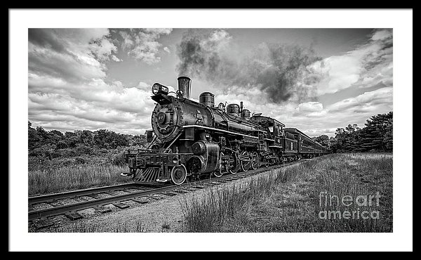
As in the image of the cottage, this train photograph using leading lines to create depth in the photograph.

Successful compositions create movement and depth in flat images. Creating an arrangement that guides the eye to move from one car to the other creating a more interesting and pleasing image.
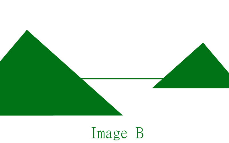
Where to start?
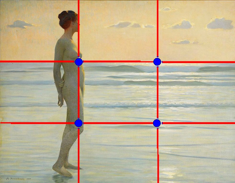
If you are interested in creating more compelling compositions in your photographs, start with the time tests “Rule of Thirds”. Simply moving your subject away from the center is a great way to move your photography from snapshots to great shots.

Symmetrical vs Asymmetrical Arrangements
If the subject lends itself to a symmetrical arrangement, go for it with very careful placement of the camera. The trick with symmetrical images is to get it perfect.
Typically asymmetrical arrangements are needed. Use odd numbers of objects, three or five. Think about creating triangles that will move the viewer’s eye around the image.

