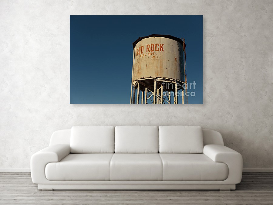
Often the suggestion to improve one’s photography is “fill the frame”. Fill the frame advice is often stated as “Get close. Then get closer.” The idea being that you want the subject to dominate the image while minimizing background distractions.
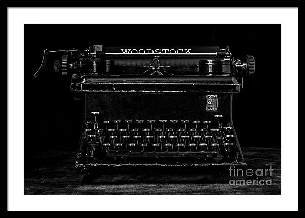
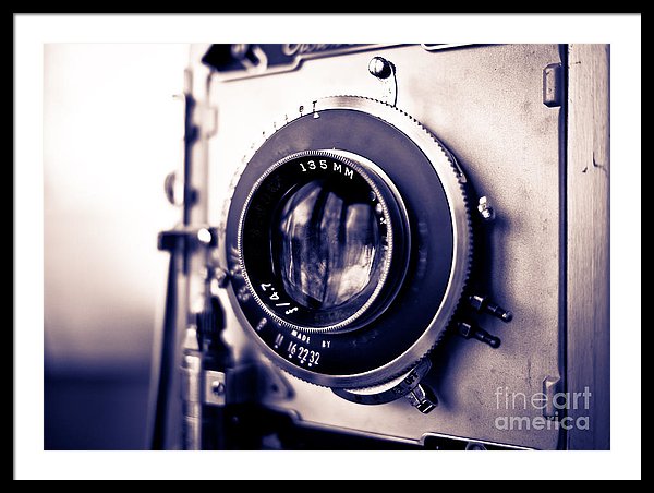

Of course filling the frame doesn’t work for all photographs or necessarily make an photograph more meaningful or powerful, because zooming in removes the context of the image.
For example in photojournalism and street photographers often work with semi-wide lens like a 35 mm for the express purpose of being able to include some of the background around the subject to give it context. You see what is going on when you see more of the story or more of the environment.
Fill the frame advice for beginner photographers helps to avoid disasters such as this:
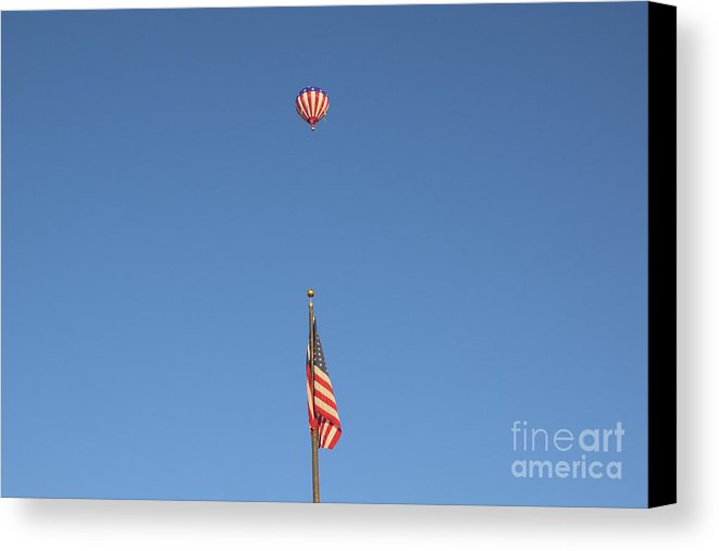
Here the photographer needs a nice big push towards their subject so the bird, flower, squirrel or in this case a hot air balloon isn’t the size of a fly in the final photograph.
You can see some interesting concept in the making – the matching of the flag with the flag hot air balloon but the execution fails with the center composition, horizontal framing and the vast blank and boring blue sky. Had the photographer turned their camera to the vertical position and zoomed in, they might have captured something interesting.
But fill the frame is only one of approaching composition. Composition is the distribution of space and the arrangement of objects within the frame.
Better Photography Through the Use of White Space
Another major composition choice is NOT TO FILL THE FRAME. When appropriate, not filling the frame or giving the subject some breathing room or white space, makes the composition of the photograph more powerful by allowing to the subject to be seen in context.
You can think of it as allowing space for text or a magazine article, although be sure that the “white space” areas are not too boring. Vast area of stark blue sky is not that appealing. In landscapes you’ll need some great clouds to keep the non-main subject areas interesting. In studio work you can introduce great back ground texture to keep the white space interesting to the viewer.
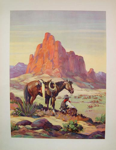
Let’s look at some example. For vast landscapes on of my favorite compositions, borrowed from western art painters, is to present the main subject at the bottom third or fourth of the frame and allow the sky to loam large.
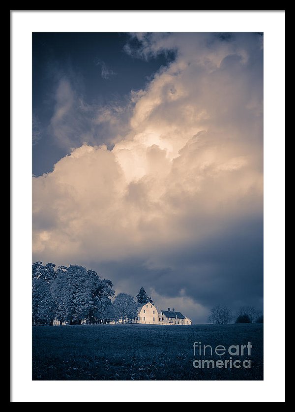
In Storm Coming to the Old Farm, I wanted to capture the relationship between the fast approaching thunderstorm and the Canterbury Shaker Village farm houses. By giving the storm clouds more than two thirds of the space, the farm buildings look small and vulnerable to Mother Nature’s approaching fury.
White Space Works Horizontally or Vertically
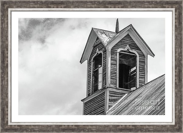
This black and white photograph of an old historic barn in Ely, Vermont uses the same concepts but in the horizontal. The white clouds in the background are given plenty of space and contrasts nicely with the old worn wood of the barn.
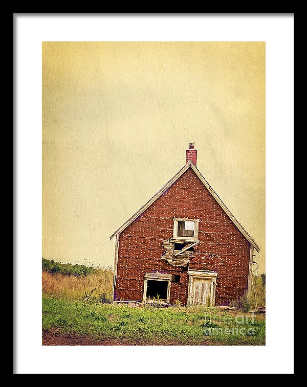
In “Forsaken Dreams” an old abandoned cottage on Prince Edward Island is placed in the bottom of the frame and texture is introduced in the sky above. The “white space” allows the viewer places to rest as they take in the scene.
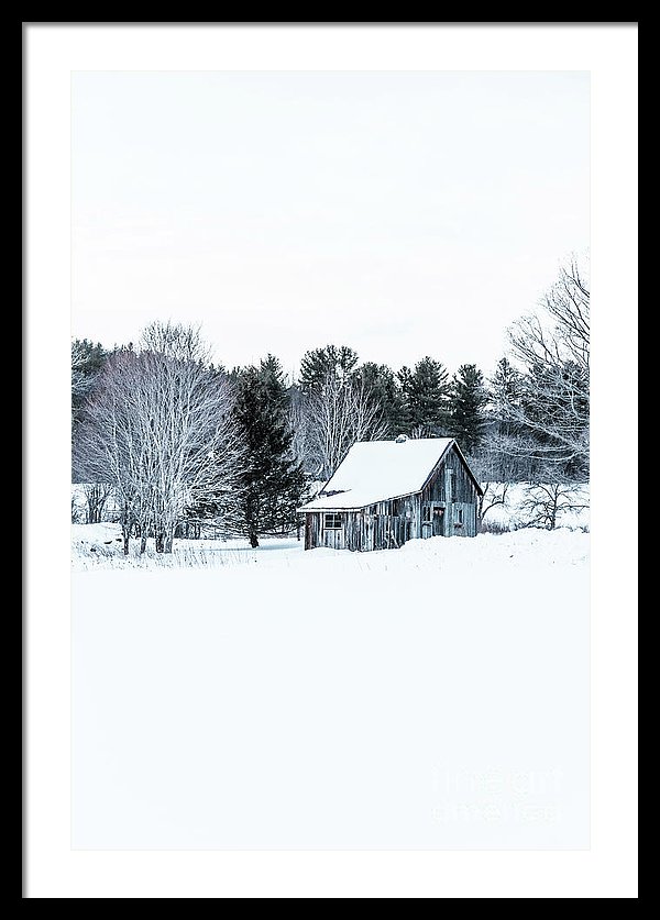
This composition, placing the old wooden cabin in the center of the frame with mostly blank snow below and a white sky above givings the image a bold graphic feeling. White space contributes to the feeling of remoteness and isolation as winter covers the landscape perhaps invoking the ideas of cabin fever or the bliss of getting away from society.
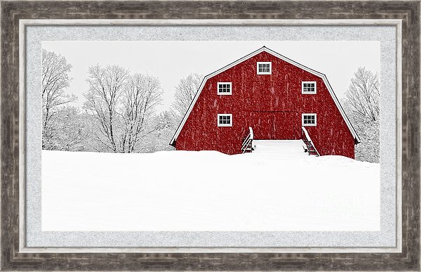
In this photograph of a classic red New England barn, the subject is placed in the upper right, eliminating most of the sky, which is white from the storm while allowing a good portion of the image to show the snow on the ground. Here one can imagine themselves in the scene and how difficult it might be to approach the barn through a deep field of snow.
Add White Space to Your Bag of Tricks
So by all means, explore your subjects from a variety of means and methods. Zoom in, fill the frame when the idea is to display an uncluttered look at the subject such as a bee on a flower, but when the situation calls for telling more of the story, step back and allow the viewer to explore the environment and context around your subject.
See more fine art photographs by Edward M. Fielding here – https://edward-fielding.pixels.com
