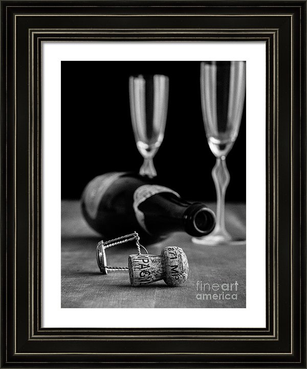
I recently sold a large canvas print of “Champagne Bottle Still Life” which is a black and white fine art photograph of an empty champagne bottle, cork and glasses but there is a whole lot more to this image than these elements. The arrangement, lighting and focal point create the story.

Champagne Bottle Still Life was created early in my re-booted career as a fine art photographer. I uploaded this image to my portfolio back in February 15th, 2013. At the time I was still experimenting with Panasonic Micro Four Thirds cameras and lenses, trying to sell enough prints to justify a leap to full frame Canon cameras.
I was studying composition and learning the tricks used by painters to create dynamic composition as well as trying to create stories within the single frame.
If you study the photograph you can see all sorts of composition tricks based on the arrangement of the objects that work to tell the story of the night perhaps of a honeymoon, anniversary or New Year’s Eve party. Which is why I think this image sells well every June during wedding and graduation party season.
In the photograph the sharp focus is centered on the cork and the background of champagne bottle and glasses are allowed to fade from focus into the dark background. Black and white is use to highlight the black of the champagne bottle and the darkness beyond. White highlights contrast the bottle label and champagne glasses while the cork is bathed in a rich light that highlights its fine, soft texture which contrasts against the hard glass surfaces of the bottle and glasses. So you have small but detailed object vs. large but minimal shapes. Black vs. white. Light vs. dark. Hard vs. soft. Textured vs. smooth. The contrasts of objects work to add intrigue and interest to the photograph.
The scene might look natural and random but the placement of each element of this photograph was carefully chosen. The cork is highlighted by being in the plane of focus and place in the bottom third according to the rule of thirds.
The cork is centered in the frame but the wire is placed to the side and slightly behind to bring the eye off center. The other objects are arranged in a zig zag fashion to pull the eye back into the photograph. The viewer is drawn from cork to wire, to bottle opening, to front wine glass and then to the back wine glass.
Notice also how the background is divided in roughly thirds with two thirds being black and approximately one third being the wood which also includes leading lines heading towards the back, drawing in the viewer.